Your board looks great and knows nothing. It’s a beautiful arrangement of boxes that has no idea whether you made money this week.
If you’ve graduated from sticky-note chaos to a proper visual canvas, you already know the high of seeing your whole plan laid out in space. You also know the quiet letdown: it’s a picture. A gorgeous, static picture that you still have to update by hand from ten other tabs.
This post is about the difference between a moodboard and a canvas that shows real numbers, and how to move from one to the other — starting with what you can do today.
Moodboard vs. dashboard: know which one you have
A moodboard is for thinking. A dashboard is for knowing. Both are useful, but confusing them is why your beautiful board feels a little useless on a Monday.
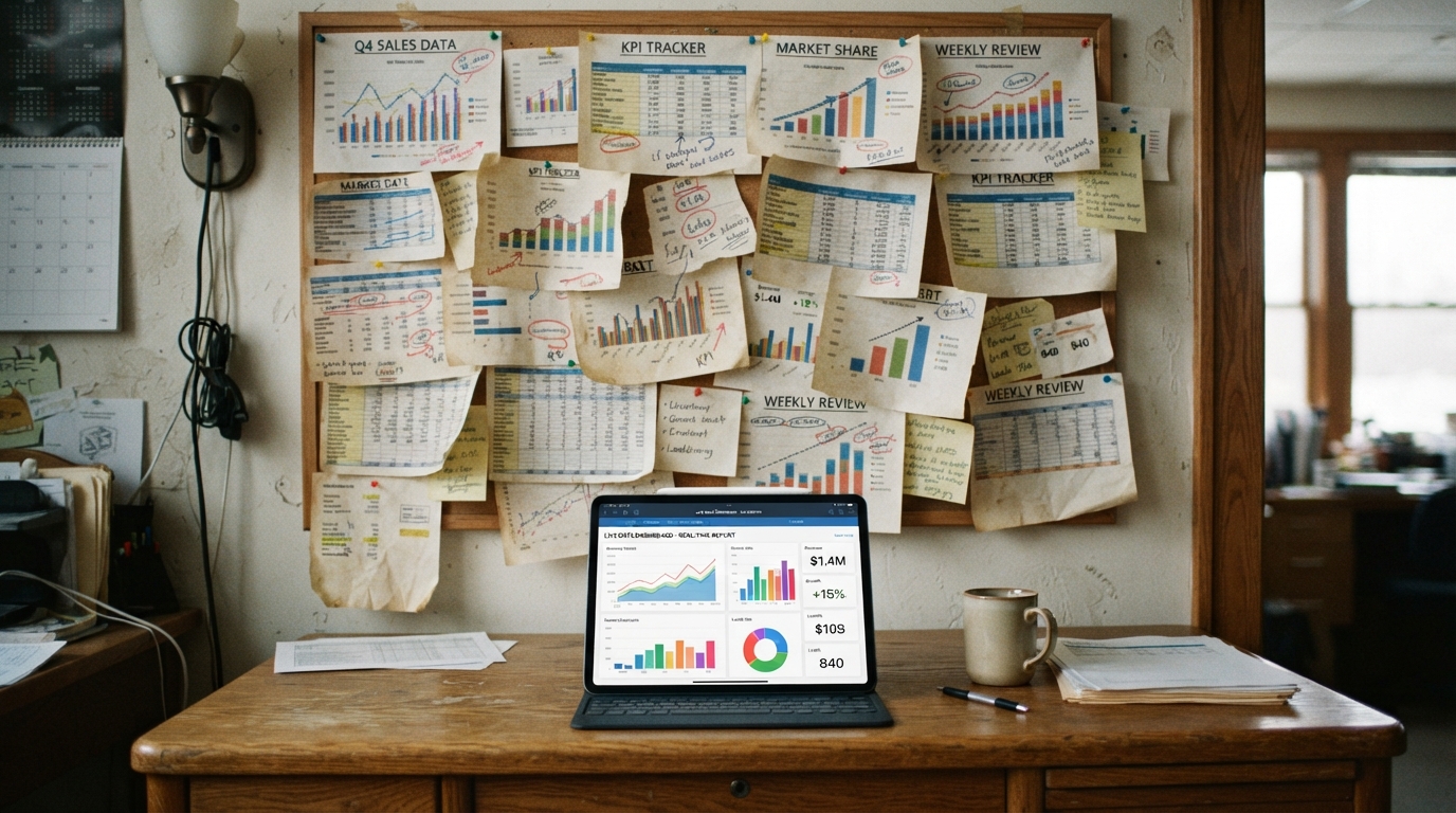
| Moodboard canvas | Canvas with live data | |
|---|---|---|
| What it holds | Images, notes, plans | Your actual figures |
| How it updates | You retype it | It refreshes on its own |
| What it answers | “What am I thinking?” | “What’s true right now?” |
| Failure mode | Goes stale silently | Stays current |
Most spatial tools stop at the left column. They’re excellent at freedom of thought and useless at “did anyone buy anything today,” because the numbers only get there if you carry them in by hand.
The manual bridge you can build today
You don’t need new software to make a board more honest. You need a small, boring ritual. Pick your three numbers that actually matter — for most operators that’s revenue, new customers, and something owed or overdue — and give each a card on your canvas.
Then, once a week, do a “numbers pass”:
- Monday, before anything else — check Stripe (or wherever the money is) and write today’s figure on the card.
- Date every number. A figure with no date is a rumor. “$4,200 — Sep 1” is a fact.
- Keep last week’s number too, so the card shows a direction, not just a dot.
That’s the whole discipline. It works, and it’s worth doing. Its only flaw is that you are the refresh mechanism, and you are unreliable — you’ll skip a week, and the board quietly lies to you.
Why “they don’t talk to each other” is the real problem
The reason your canvas can’t show real numbers isn’t the canvas. It’s that your tools don’t talk to each other. Stripe doesn’t know about Shopify, YouTube doesn’t know about your calendar, and none of them know about your board.
So you become the integration. Every screenshot pasted into a doc, every figure retyped from a tab, is a symptom of that gap. Putting your whole business in one place is really about closing it, so the numbers arrive instead of being fetched.
There’s a subtler tax, too. When your board is a snapshot, you don’t fully trust it, so you re-check the source anyway “just to be sure.” That double-checking is the app-switching you were trying to escape. A canvas only saves you time when the number on it is trustworthy enough that you don’t feel the urge to go verify it in the original tab.
Design the numbers so you can actually read them
Live or manual, a number card is only useful if it answers a question at a glance. Three quick rules make any figure more honest:
- Show the direction, not just the value — “$4,200, up from $3,900” beats a lonely “$4,200.”
- One number per card — a card that shows six figures shows none of them clearly.
- Label what it means, not what it’s called — “money in this week,” not “gross_volume_7d.”
Good numbers on a board are less about the chart and more about the question each card answers. If a card doesn’t map to a decision you make, it’s decoration, and decoration is what made the pretty board feel useless in the first place.
Define each number before it goes on a card
“Revenue” on a card means nothing until you decide which revenue. Pick one definition per card, write it on the card, and read it from the same place every time. Three common ones:
| Card | Definition to pick | Where to read it | How fresh it is |
|---|---|---|---|
| Recurring revenue | MRR, with discounts either in or out (decide once) | Stripe’s Billing overview; you can configure how Stripe calculates MRR, churn and active subscribers (Stripe Docs) | Changes to the definition take 24–48 hours to show |
| Money in | Successful payments over a fixed window, such as the last 30 days, and whether refunds are subtracted | Your processor’s payments list for that window | As current as the processor |
| Traffic | Sessions (or users) over a fixed window, such as 28 days | GA4 reports; for “right now”, the Realtime report shows active users in the last 5 and 30 minutes (Realtime report) | Realtime: minutes. Standard reports: processing can take 24–48 hours (data freshness) |
A finished card spec then reads like this: “Money in, last 30 days: $4,200, up from $3,900 in the 30 days before, as of Sep 28.” Value, comparison, window, date. If two cards on your board use different windows or definitions, they will disagree, which is the problem covered in three dashboards, three different numbers.
If you use Vexlynk, here is what its cards give you so you can label them honestly: the Stripe card shows MRR, the last 30 days (successful charges, refunds not subtracted) and active customers; the Google Analytics card shows sessions, users, bounce and time on site over 7, 28 or 90 days. On the desktop app they refresh every five minutes while the app is open; the web workspace refreshes them on a slower cloud schedule.
Links checked September 28, 2026.
And here’s the version where the numbers arrive on their own
In Vexlynk, you connect your data sources — Stripe, Shopify, Google Analytics, YouTube, and more — and each becomes a live card on one board that refreshes on its own. Same spatial canvas you love, except the revenue card shows current MRR and the last 30 days without you touching it. These sources are read-only, so nothing changes on their end.
Because the figures are real and current, an agent that reads your actual board can answer questions grounded in your numbers — not generic advice that could apply to any company — when you ask. Chart design principles matter here too: the goal is clarity, not decoration (Storytelling with Data).
Frequently asked questions
Can’t I just screenshot my dashboards onto a canvas?
You can, and it’s a fine start. But a screenshot is frozen the instant you take it. A live card keeps updating, which is the whole difference between looking current and being current.
Which numbers should go on the board first?
Money in, customers in, and anything overdue. Three live cards beat thirty static ones. Add more only once the first three earn their place.
Does connecting a source change anything in it?
No. Connecting only reads. Most sources are read-only; a few (WhatsApp, Trello, ClickUp, Google Calendar) let you act from the card, only when you do it yourself — sending a message, or archiving, completing or deleting something, asks you to confirm first. Nothing writes on its own, and the board never writes back to Stripe or Shopify.
Where do the numbers actually live?
On the desktop app, boards are local-first and stay on your machine; cloud sync is off by default and available on Plus and Pro. On the web workspace, boards are kept in the cloud. The honest caveat: asking the hosted agent sends relevant board context to the model, or bring your own key and bill your own provider.
If you’d rather see it than build it, Vexlynk’s free plan puts your first live number on a board in a few minutes.
When was the last time a number on your board was actually true today, not last Tuesday?
Vexlynk
Vexlynk Team